
Catalogue-first customer journey
Collections, categories, favourites and enquiries follow the way customers naturally browse handcrafted pieces rather than forcing a checkout-led ecommerce model.
SELECTED WORK
The finished website is only the visible part. Each project starts with the business problem, the people using it and the decisions needed to make the experience clearer, more useful and easier to manage.
LATEST WORK · 01
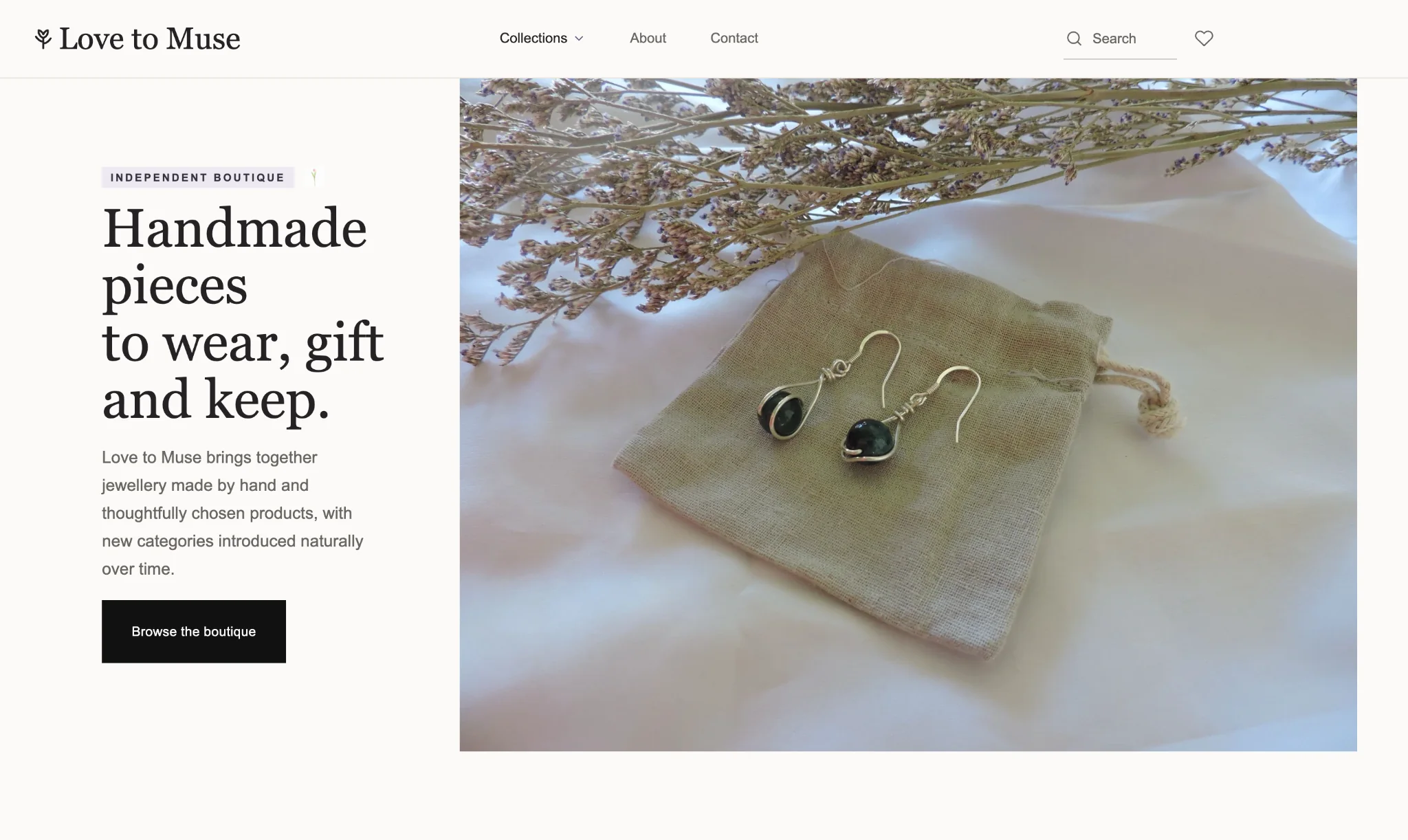
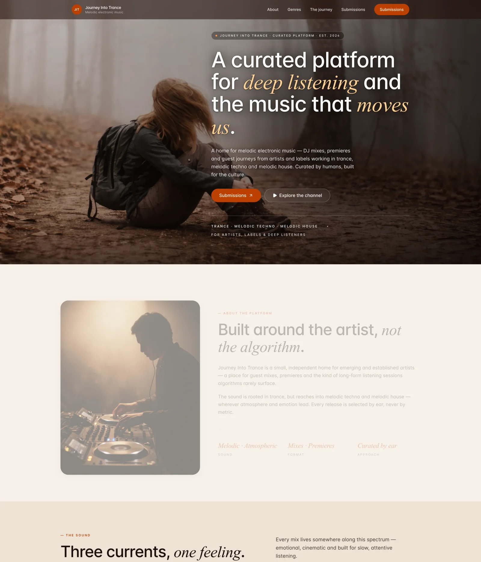
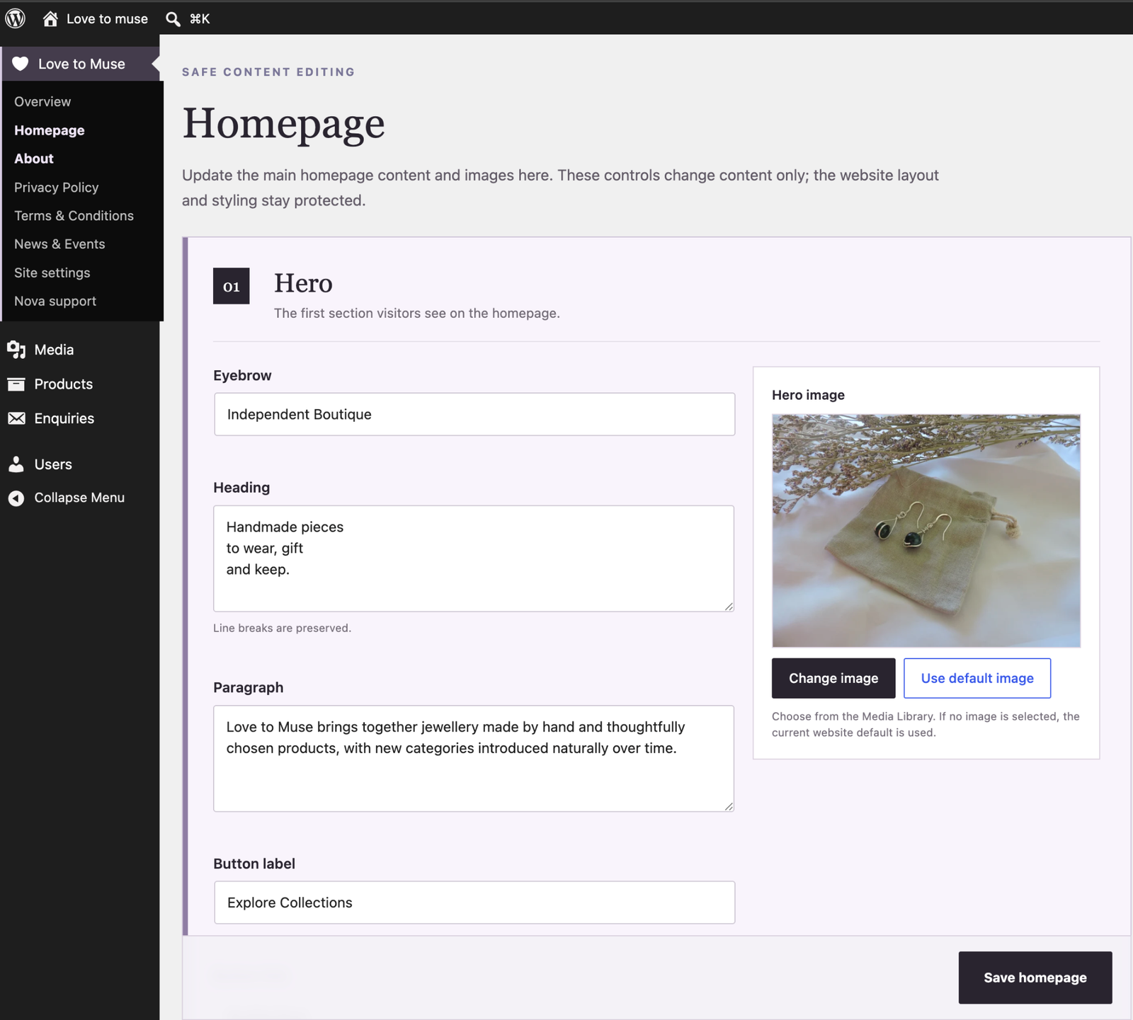
A bespoke catalogue experience for an independent jewellery business, with the customer-facing site and the client CMS designed as one connected system.
Visit Love to MuseTHE RATIONALE
Love to Muse needed the richness of a product catalogue without the operational complexity of ecommerce it was not ready to run. WooCommerce therefore stays underneath as a future-ready product framework, while price, cart and checkout are deliberately removed from the current customer journey.
The same principle shaped the backend. Instead of handing the client a standard WordPress/WooCommerce admin full of irrelevant controls, Nova designed a guided CMS around the jobs she actually performs.
Collections, categories, favourites and enquiries follow the way customers naturally browse handcrafted pieces rather than forcing a checkout-led ecommerce model.
Image-led layouts, restrained hierarchy and product storytelling make the catalogue feel like the brand rather than a reskinned shop template.
The narrow-screen journey was treated as a primary experience with clear content priority, large touch targets and product cards that remain easy to scan.
Hick’s Law reduces unnecessary choices, Fitts’s Law informs tappable actions, Gestalt grouping keeps related information together and Jakob’s Law preserves familiar patterns where familiarity helps.
Relevant tasks are surfaced through a simplified Love to Muse dashboard and guided editors while technical WordPress and WooCommerce complexity stays out of day-to-day use.
The catalogue architecture stays technically ready for later ecommerce while enquiries, SEO foundations, analytics and managed support serve the current business phase.
THE CLIENT EXPERIENCE
A standard WordPress and WooCommerce backend can expose dozens of controls, labels and technical concepts that have nothing to do with the client’s everyday job. We mapped the real tasks first, then simplified the client-facing admin around them.
FEATURED PROJECT · 02
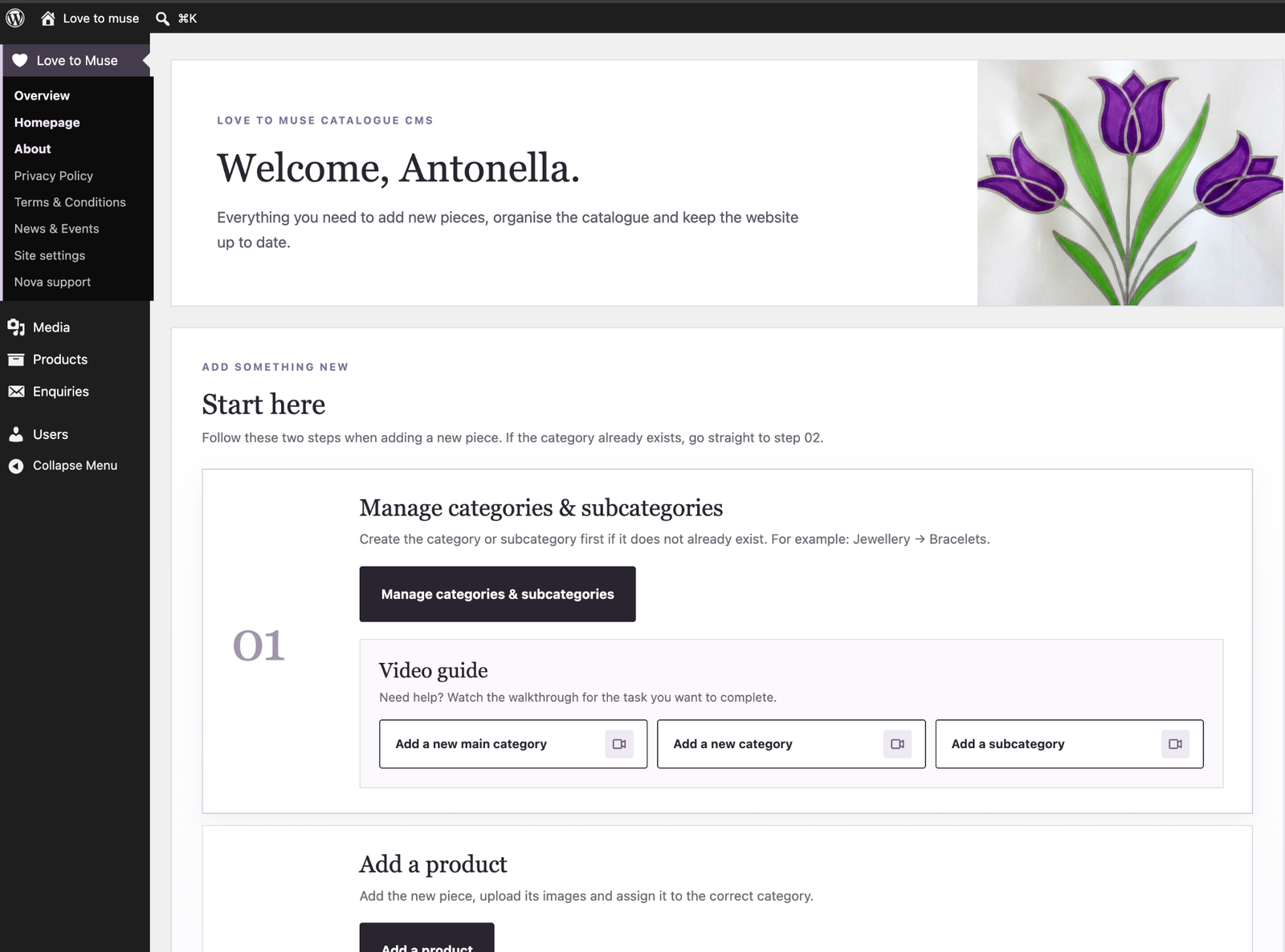
A brand-new bespoke platform for melodic electronic music, created from scratch around listening, discovery and artist submissions.
Visit Journey Into TranceTHE RATIONALE
The challenge was to give a niche brand a strong editorial point of view while keeping discovery effortless. The visual atmosphere needed to support the music rather than compete with it, and listeners, artists and labels each needed an obvious route through the experience.
Defined the platform proposition and organised content around listening, discovery, editorial content and submissions.
The mobile hierarchy prioritises the story, channel discovery and submissions with large thumb-friendly actions, readable line lengths and deliberate vertical rhythm.
Fitts’s Law supports prominent tap targets, Hick’s Law keeps the main choices focused, Gestalt proximity groups related content and Jakob’s Law keeps core navigation familiar.
Editorial typography, imagery, contrast and responsive composition create a strong identity without sacrificing orientation, readability or task completion.
SELECTED PROJECTS
Not every project needs to occupy several screens on this page. These case studies stay compact here, but the full rationale, desktop and mobile views are one click away.
JOURNEY INTO TRANCE PRODUCTIONS
Mastering, education, artist development and Journey Into Trance brought together under one coherent parent experience.
JOURNEY INTO TRANCE ACADEMY
A focused academy experience that makes the offer, learning path and next step easier to understand.
THE WORK BEHIND THE WORK
Nothing is added because that is what websites have. We work from the business problem, user expectations and proven interaction principles, then decide what deserves attention on desktop, mobile and inside the CMS.
Business, users, market and competitors.
Positioning, journeys, structure and priorities.
Mobile-first hierarchy, UI, feedback and refinement.
Responsive delivery, launch, analytics and improvement.
Local Web & Digital
Nova Digital supports businesses across Bedfordshire, Hertfordshire and London, with remote Web & Digital projects available throughout the UK.
Remote Web & Digital projects are available across the UK.
HAVE A PROJECT IN MIND?
Tell us what you are trying to achieve and we’ll recommend the right next step.